Creating a responsive time travel booking website for a revolutionary brand.
Background
For the first time in history, a total of 289 destinations worldwide has been approved to be time traveled to where travelers will be able to look at and do things typical of the time in a controlled and protected environment. Zeit is spearheading this market and wants to develop an e-commerce website for travelers to book their trip and choose activities all in one place from any electronic device.
Role: UX Designer
Tools: Figma, Invision, OptimalSort, Pen & Paper
Platform: Desktop, Tablet, iOS
The Challenges
Zeit is a conceptual company that is entirely new and will need to establish its brand from the ground up.
Being the first in the market, Zeit will need to set the standard for time traveling companies and time travelers.
Consumers are completely unfamiliar with time travel and will need to be informed about all aspects of the trip.
The public is familiar with the standard ways of booking trips and will compare the time traveling process to their understanding of travel.
Project Goals
Develop a website that enables consumers to realize time traveling is a worthwhile expense.
Create a strong logo and brand.
My Approach
Identify the traveler’s concerns before, during, and after a trip.
Determine what information travelers need when booking travel.
Develop a brand that appeals to Zeit’s target market.
Explore how to develop a website that enables consumers to realize time traveling is a worthwhile expense.
1/ Research
Consumers spend big on vacations
Time travel may be new, but travel booking companies have been successfully helping travelers around the world for decades. To understand the travel industry and the companies that help it thrive, I did market research and competitor analysis of some travel companies that offer similar services to consumers. With the research, I created 5 provisional personas to help me get a basic understanding of Zeit’s target market.
Online booking is popular
84% of consumers book travel through online travel sites.
Families want to be entertained and happy
For family travelers, 95% of their priority was keeping families entertained and happy.
Millennials show and tell online
74% of all travelers use social media during travel. But a surprising 97% of Millennials share photos on social media while traveling.
2/ Empathize
Identifying the time traveler
Using the provisional personas as a guide, I interviewed 3 millennial travelers through 1:1 remote meeting. I wanted to understand their needs and frustrations when booking trips to give me insights into how to approach designing Zeit. I used an affinity map to synthesize the data, and identify the most useful findings.
Travelers want unique experiences
All participants reported a preference for traveling places with less tourists, and spending their time in areas that are lesser known.
Find the best deals
Regardless of travel experience, all participants expressed a concern for spending money both in the planning phase and during their trip. This was a common theme throughout.
Inconsistent pricing is a pain
2 of the 3 participants reported checkout prices not aligning with their expectations as one of the top pain points.
Stay safe
2 of the female participants expressed multiple times during the interview their safety being on their mind.
3/ Define
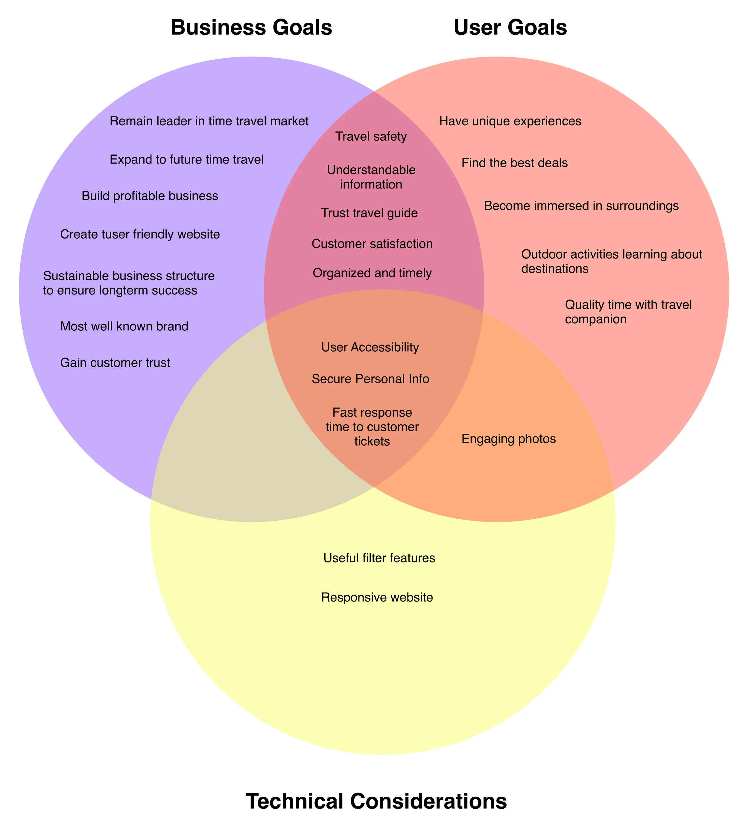
As an advocate for the user and business, I needed to identify what both group’s individual goals were and where they crossed or conflicted. This would minimize any potential conflict later on. Additionally, I needed to be conscious of any technical limitations and only design for what’s possible.
What are the business goals for the product?
What are the product user's goals?
What are the shared goals of both business and users?
What are the technical restrictions or considerations to keep in mind?
Where, when, and what type?
With 289 destinations to sort, I needed to understand how users categorize and organize them so that users are able to do quick searches that provide accurate search results. Using OptimalSort, I conducted an online open card sorting with 6 participants and 30 cards from various time periods and themed events. I used the program’s similarity matrix to identify trends that would help me decide on how to categorize the time travel trips.
3 participants created at least 1 category based on the location of the event, and 4 participants organized based on time in history. Participants also tended to categorize the cards into themed events such as pop culture. Through this, I decided to offer consumers 3 distinct categories: location such as continents, time period, and type of experience.
Mapping out the connections
To get a more clear understanding of the pages and how they’re connected, I created a sitemap and defined the website’s information architecture.
Userflow
I then created 2 task flows based on the persona to understand how the consumer will interact with the site with different motivations.
Task #1: Michelle is familiar with Zeit and has taken trips with the company before. She access es the website from her browser bookmark looking for her next adventure.
Task #2: Michelle has heard good reviews from friends about Zeit and is interested in learning more about what the company offers.
4/ Ideate
Making it available on all devices
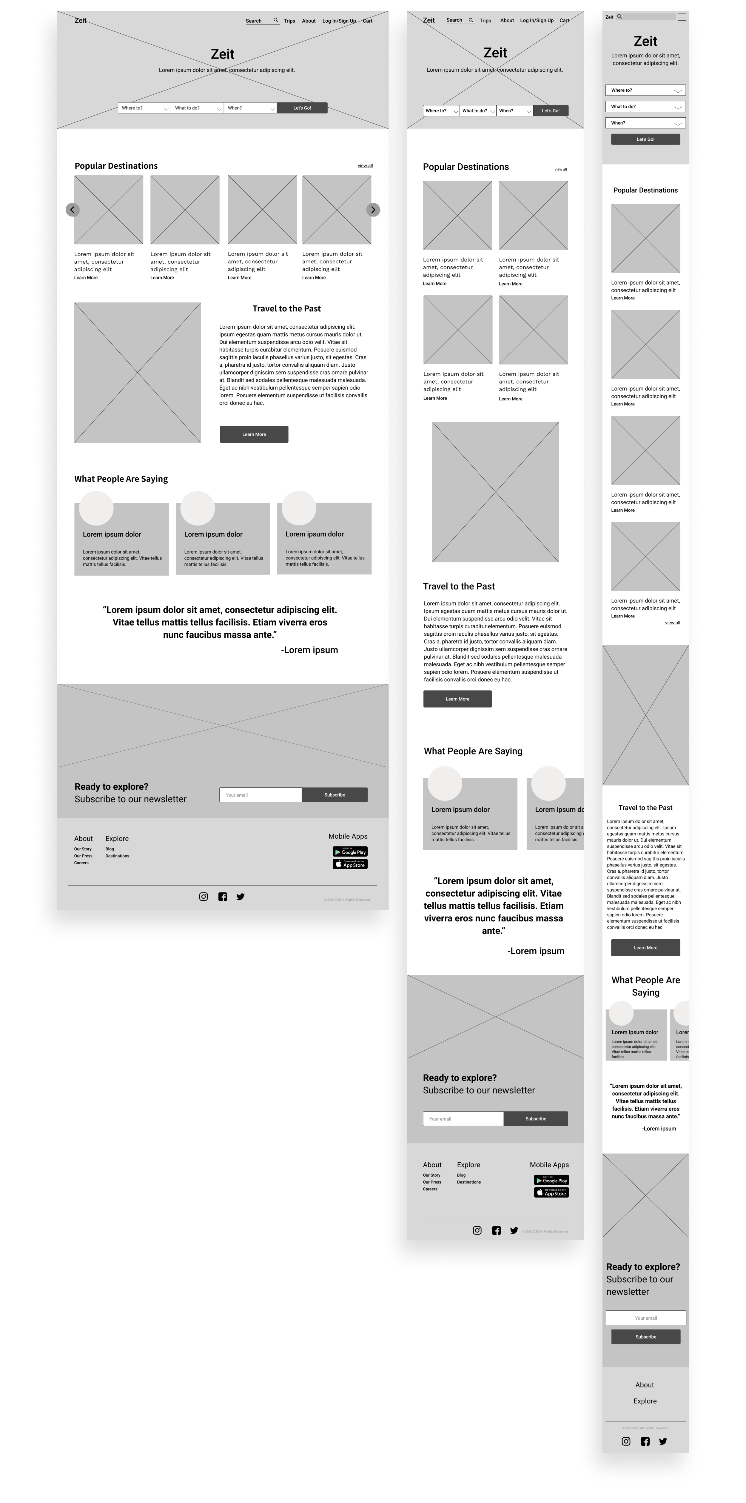
I first made some quick sketches to develop basic designs and created low-fidelity wireframes. It was important the designs were responsive to accommodate customers at all points, so I designed the homepage in desktop, tablet, and iPhone.
Branding
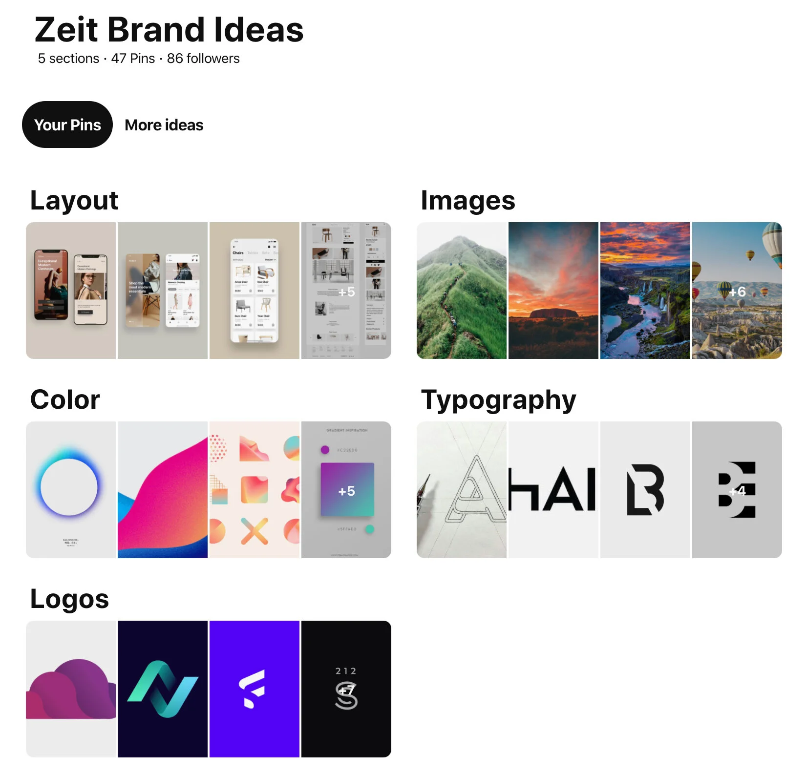
To design a UI focused on a specific image, I needed to develop the brand. So I created a mood board for inspiration and first established brand keywords. I wanted to avoid the “spacey” image, as I identified the consumer to be a contemporary traveler but not a sci-fi enthusiast. After creating the logo, typography, and color palette, I assembled a brand style tile with images to help with my design decisions.
Applying UI
With the brand established I applied the UI designs to the wireframes for pages that I would need for the prototype. My focus was on highlighting the uniqueness of the trips and providing information in ways that would help users to decide on the perfect trip in the most efficient way.
5/ Prototype & Test
Let’s put the designs and information to the test
I did a usability testing with 4 participants instructed to complete 2 tasks:
You want to search for the trip Opening of the Roman Colosseum in Europe.
Book 1 trip Opening of the Colosseum for yourself.
I was interested in how people search for the trip, and if all the necessary information was provided to the traveler in an understandable and digestible way that would give them confidence in their purchase. In order to encourage the consumer past the cart and to the checkout, as a starting point, it was important to provide the necessary information in a clear way. Using an affinity map, I synthesized the data and identified some needed revisions.
6/ Iterate
Priority changes
Clarifying limitations
Safety was a big concern for most travelers, particularly for females and those with families. Users needed to know about any age restrictions for particular trips due to safety or health concerns. So I included an age minimum on the more strenuous or active trips to indicate if they were suitable for children or not.
Defining ratings
Users also weren’t sure what each rated Activity Level number meant, and needed clarity on what it involved. So I placed an information icon beside the activity level that explained the number rating when clicked.
Inclusive costs
Confirming a finding early in my research, consumers dislike any surprised at checkout. Before reserving a trip, participants asked what was included in the total and if there were any fees. To avoid any confusion, I added a “What does this include?” button at the bottom of the total to dissipate any worries there might be hidden fees.
Things you should know & the important stuff
Participants had questions about details such as meals, lodging, what to pack, and information about the time period of the trip. Instead of placing it in a collapsable menu hidden from immediate view, I made this information available to the user with the option to chat with a representative if the consumer had any further questions.
7/ Reflections
Looking ahead
Zeit was a fun and challenging project. Entering the uncharted field of time travel was entirely new, but it taught me the value in assessing what’s familiar to consumers and doing a deeper dive into their reasoning instead of trying to create something entirely new. Next steps would be to test what assumptions consumer have when entering a time traveling website to ensure the design aligns with their expectations and needs.


